
With a proactive Starting-Block SEO plan


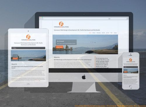
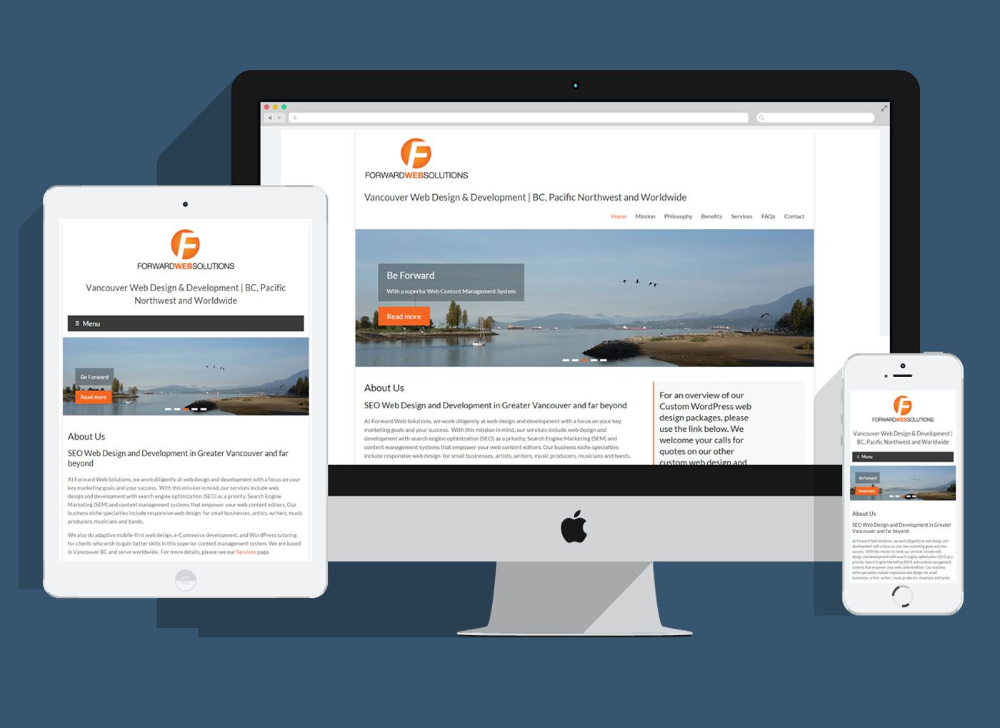
Mobile responsive websites are now a necessity… Is your website Mobile Ready?
Now that the World Wide Web and millions of Internet users have gone Mobile, multiple millions of mobile device users normally shop online with iPhones, Android or Windows phones, as well as tablets. Regular web analytics indicate that increasingly more internet users each month begin to use e-Commerce on their mobiles. This fact fully validates the need for mobile responsive websites that are user-friendly on all types of internet-enabled devices… computers, tablets, “phablets” and smart phones. Recent studies by Google show that typical online shoppers begin their searches for products or services on smart phones and then follow up with an iPad, Android tablet, laptop or a desktop computer to check out the websites and products that have caught their interest. It is elementary that increasingly more purchases decisions are being initiated from mobile phones. Even if you don’t implement E-commerce on your website, you must face, as a website owner, that the progressive internet-use habits of millions of people in Canada, the US, Europe, Asia and globally are important to you.
These mobile multitudes are becoming accustomed to using their smart phones on a daily basis for help in making purchasing or donation decisions. This is why specialty retail stores, restaurants, medical or dental services, insurance, business, real estate listings, salons, spas, travel sites, community services and charity sites require mobile responsive websites. If you don’t have one of these by now, it’s time to implement one.
That is why entrepreneurs, artists, musicians, businesses, clinics, non-profits and many online organizations are acquiring mobile-friendly websites. And, if you have such a correctly coded and well-designed website, you really only need that one site. The perceived need to maintain a second “mobile website” is outdated; all you really require is one fully-responsive website. So, speak with your web developer regarding the mobile-friendly essentials, and know that, whether “Responsive” or Responsive-Adaptive, your new website should be capable of serving user-friendly and relevant content in all screen sizes, all major operating systems and all essential browsers.
There are different types of Responsive websites. The Fluid Responsive design provides easy viewing of the same content in different screen sizes. The “Adaptive” design attributes deal with adapting to the detected devices, whether it uses Android, iOS or Windows in mobile phones / tablets. Some of the best web coding disciplines involve Fluid Responsive design plus a number of up-to-date Adaptive approaches to make websites cater to the inevitability of multi-device users.
To clarify our preference for “mobile responsive websites”: It is our mission to develop fully responsive, mobile-first websites that are fluid in response to any screen size, rather than just a preset selection of different screen widths. Having a mobile-first responsive website is helpful to your site visitors, increases conversion rates and is also a vital factor in search engine optimization. Mobile responsiveness is absolutely essential as an SEO practice, because the search engine robots (Googlebots, Bing and Yahoo robots and robot crawlers from other legitimate search engine) use algorithms that automatically detect whether your website is responsive and rank your search results much higher if your website is adaptable or responsive to various screen sizes and device types.
At Forward Web Solutions, we’re dedicated to multi-device web design, also known as mobile-first web design as one of our keys to moving your enterprise forward,and with websites that engage and convert your audience. For more information, contact us now about this modality of design, and about our easy-to-use WordPress Content Management Systems which we build on WC3 standards supporting fluid response for multiple devices and screen sizes.
Test this page! Collapse it so it is not full screen, if you are using a computer; then, grab a corner of the window to resize the page. Notice how the the images and other content reduce in size to flow with the window size. Accordingly, this page responds to screen size for each different mobile device.